From Bland to Bold: 10 Color Palettes That Redefine Your Home
Choosing the right color palette can feel overwhelming, but understanding the principles of color theory and considering the existing elements of your home can make the process much smoother. These ten palettes represent a range of styles, from earthy and organic to vibrant and energetic, ensuring there's something to suit every taste.
1. Earthy Oasis: Terracotta, Sage, and Cream
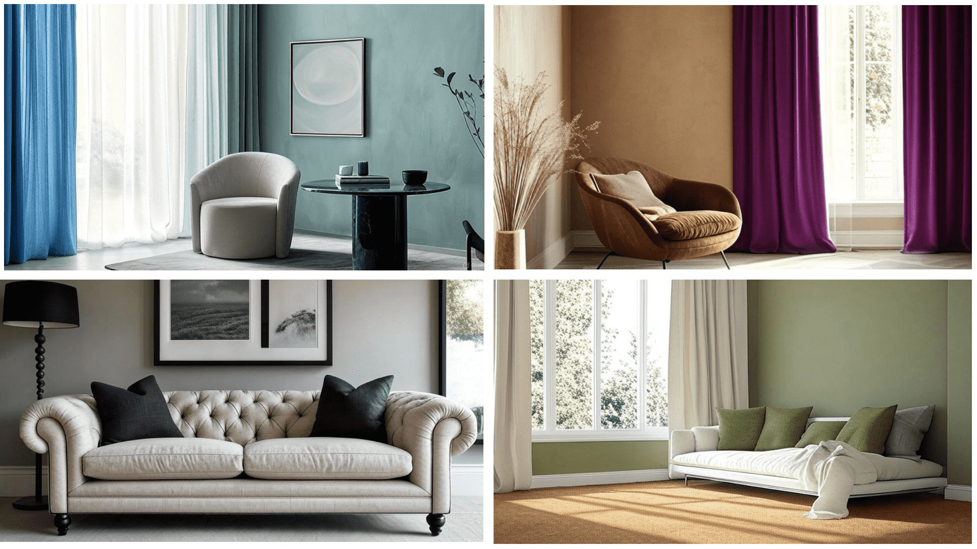
This palette evokes a sense of calm and connection to nature. Terracotta brings warmth, sage adds a touch of serenity, and cream provides a grounding neutral. It's perfect for living rooms and bedrooms where relaxation is key. Consider using terracotta for accent walls, sage for upholstery, and cream for the main wall color and trim.
2. Coastal Breeze: Teal, Sand, and White
Capture the essence of the ocean with this refreshing palette. Teal brings depth and tranquility, sand provides a warm contrast, and white keeps things light and airy. Ideal for bathrooms and bedrooms, this palette creates a soothing and invigorating atmosphere. Use teal for accent pieces, sand for flooring or furniture, and white for walls and ceilings.
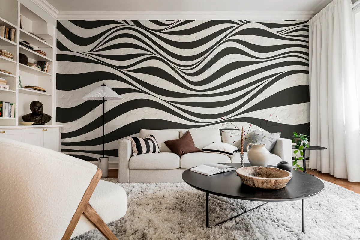
3. Modern Monochrome: Gray, Black, and White
A timeless and sophisticated choice, monochrome offers a clean and contemporary look. Varying shades of gray add depth, black provides striking accents, and white creates a sense of space. This palette works well in any room, but is particularly effective in kitchens and offices. Layer different textures to add visual interest.
4. Jewel Tones: Emerald, Sapphire, and Gold
For a touch of luxury and drama, jewel tones are the answer. Emerald brings richness, sapphire adds depth, and gold provides a glamorous accent. This palette is perfect for dining rooms and living rooms, creating a sense of opulence and sophistication. Use emerald and sapphire sparingly as accent colors, and gold for hardware and accessories. Consider a dark neutral background to make the jewel tones pop.
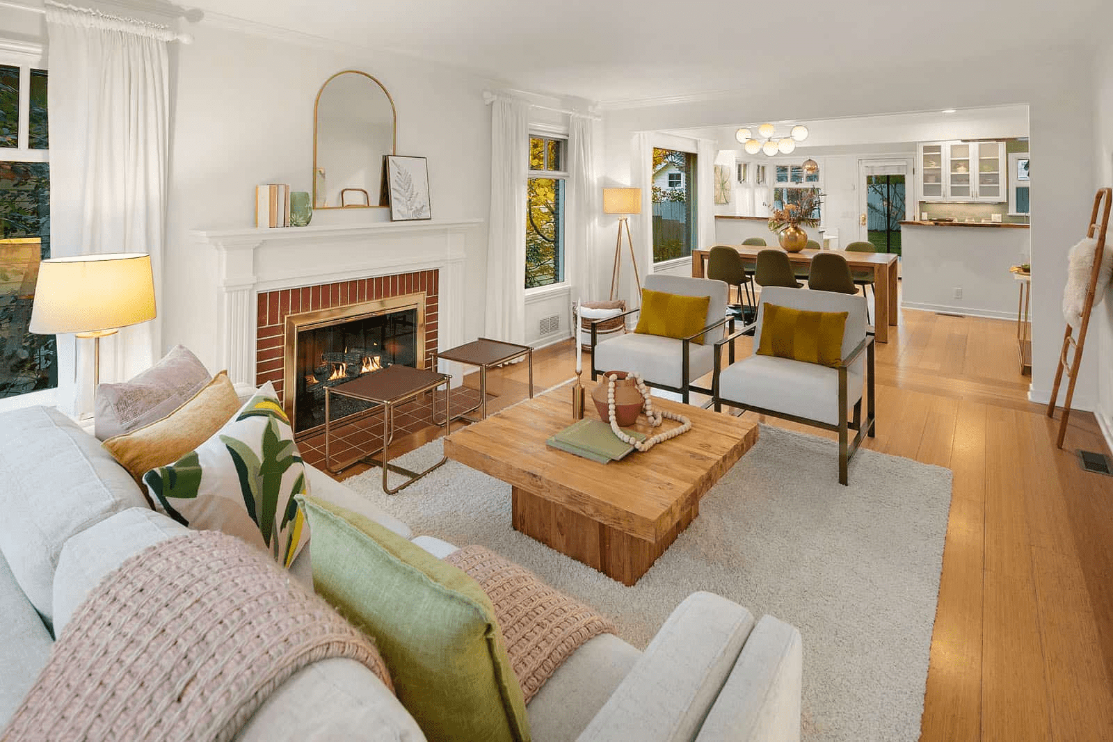
5. Retro Revival: Mustard Yellow, Olive Green, and Brown
Embrace the warmth and nostalgia of the mid-century modern era with this retro palette. Mustard yellow brings energy, olive green adds a touch of earthiness, and brown provides a grounding element. This palette works well in living rooms and bedrooms, creating a cozy and inviting atmosphere. Think mustard yellow accent chairs, olive green walls, and brown leather furniture.
6. Bohemian Rhapsody: Turquoise, Coral, and Beige
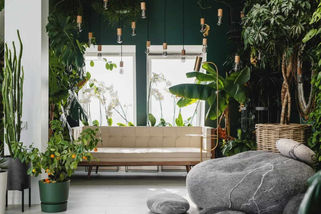
This eclectic palette is perfect for those who love a relaxed and unconventional style. Turquoise brings a sense of adventure, coral adds vibrancy, and beige provides a neutral backdrop. Ideal for living rooms and bedrooms, this palette encourages creativity and self-expression. Mix and match patterns and textures for a truly unique look. Consider adding natural elements like wood and plants to enhance the bohemian feel.
7. Scandinavian Simplicity: Light Blue, Gray, and White
Create a serene and minimalist space with this Scandinavian-inspired palette. Light blue brings a sense of calm, gray adds a touch of sophistication, and white keeps things bright and airy. Perfect for bedrooms and bathrooms, this palette promotes relaxation and clarity. Focus on natural light and simple, functional furniture.
8. Industrial Chic: Concrete Gray, Black, and Copper
This edgy palette is perfect for modern lofts and apartments. Concrete gray provides a raw and urban feel, black adds a touch of drama, and copper brings warmth and shine. Ideal for kitchens and living rooms, this palette creates a bold and contemporary statement. Expose brick walls and pipes to enhance the industrial aesthetic.
9. Pastel Dreams: Lavender, Mint Green, and Peach
For a soft and romantic look, pastel colors are the perfect choice. Lavender brings a sense of calm, mint green adds a touch of freshness, and peach provides warmth and sweetness. This palette works well in nurseries and bedrooms, creating a gentle and inviting atmosphere. Consider using pastel shades on walls, furniture, and accessories.
10. Bold Contrast: Navy Blue, Orange, and White
Make a statement with this high-contrast palette. Navy blue brings depth and sophistication, orange adds energy and warmth, and white provides a clean backdrop. Ideal for living rooms and dining rooms, this palette creates a dynamic and visually stimulating space. Use navy blue for walls or large furniture pieces, orange for accent colors, and white for trim and ceilings.
Practical Guidance: Choosing the Right Palette for Your Home
Selecting the perfect color palette involves careful consideration of several factors:
- Existing Elements: Consider the colors of your existing furniture, flooring, and fixtures. Choose a palette that complements these elements rather than clashes with them.
- Room Size and Lighting: Dark colors can make a small room feel even smaller, while light colors can make a room feel more spacious. Consider the amount of natural light in the room. Darker rooms benefit from lighter palettes.
- Personal Style: Choose a palette that reflects your personal taste and preferences. Don't be afraid to experiment and create a unique look.
- Room Function: Consider the purpose of the room. Bedrooms and bathrooms typically benefit from calming colors, while living rooms and dining rooms can handle bolder palettes.
- Color Psychology: Understand the psychological effects of different colors. Blue is often associated with calmness and tranquility, while red is associated with energy and excitement.
To help you visualize your color choices, use online color palette generators or create mood boards with fabric swatches and paint samples. Test paint colors on small areas of your walls before committing to a full room makeover.
Long-Term Considerations: Maintaining Your Color Scheme
Maintaining your chosen color palette is essential for preserving the overall aesthetic of your home. Here are some long-term considerations:
- Paint Quality: Invest in high-quality paint that is durable and easy to clean. This will help prevent fading and chipping.
- Regular Cleaning: Clean your walls and surfaces regularly to remove dust and dirt. This will keep your colors looking fresh and vibrant.
- UV Protection: Protect your furniture and fabrics from fading by using UV-blocking window treatments.
- Touch-Ups: Keep a small amount of your paint colors on hand for touch-ups. This will help you quickly address any scratches or blemishes.
- Seasonal Updates: Consider updating your accessories seasonally to refresh your color scheme. This can be as simple as changing out throw pillows or adding a new rug.
| Color Palette | Dominant Colors | Room Preference | Psychological Effect | Maintenance Level |
|---|---|---|---|---|
| Earthy Oasis | Terracotta, Sage, Cream | Living Room, Bedroom | Calming, Grounding | Low |
| Coastal Breeze | Teal, Sand, White | Bathroom, Bedroom | Soothing, Invigorating | Medium |
| Modern Monochrome | Gray, Black, White | Kitchen, Office | Sophisticated, Clean | Medium |
| Jewel Tones | Emerald, Sapphire, Gold | Dining Room, Living Room | Luxurious, Dramatic | High |
| Retro Revival | Mustard Yellow, Olive Green, Brown | Living Room, Bedroom | Cozy, Nostalgic | Low |
| Bohemian Rhapsody | Turquoise, Coral, Beige | Living Room, Bedroom | Relaxed, Creative | Medium |
| Scandinavian Simplicity | Light Blue, Gray, White | Bedroom, Bathroom | Serene, Minimalist | Low |
| Industrial Chic | Concrete Gray, Black, Copper | Kitchen, Living Room | Edgy, Contemporary | Medium |
| Pastel Dreams | Lavender, Mint Green, Peach | Nursery, Bedroom | Soft, Romantic | Low |
| Bold Contrast | Navy Blue, Orange, White | Living Room, Dining Room | Dynamic, Stimulating | High |
FAQ: Frequently Asked Questions
- Q: How do I choose a color palette that won't go out of style?
- A: Opt for classic and timeless color combinations, such as neutrals with pops of color, or monochromatic schemes. Avoid trendy colors that may quickly become dated. Consider consulting [design trends resources](https://www.example.com/design-trends) for insights, but prioritize your personal preferences.
- Q: What's the best way to test a color palette before committing?
- A: Purchase small samples of paint and apply them to different areas of your walls. Observe how the colors look in different lighting conditions throughout the day. You can also use online color visualizers to get a better idea of how the palette will look in your space.
- Q: How can I incorporate a bold color palette without overwhelming the space?
- A: Use bold colors sparingly as accent colors. Balance them with neutral colors to create a harmonious and balanced look. Focus on using the bold colors in accessories, artwork, or accent walls rather than painting the entire room.
- Q: What are some good resources for finding color palette inspiration?
- A: Websites like Pinterest, Houzz, and design blogs are great sources of inspiration. Interior design magazines and books can also provide valuable ideas and guidance. You can also check [color theory resources](https://www.example.com/color-theory) to understand the fundamentals of color combinations.
- Q: Can I mix and match different color palettes in my home?
- A: Yes, but it's important to create a cohesive and harmonious look. Choose palettes that share a common thread, such as a similar undertone or a consistent level of saturation. Avoid using too many different colors, as this can create a chaotic and overwhelming effect.
Disclaimer: This information is for informational purposes only. Color perception can vary, and individual results may differ. Always test colors in your own space before making final decisions.
Sources:
- Pantone Color Institute: https://www.pantone.com/
- Benjamin Moore Color Trends: https://www.benjaminmoore.com/en-us/color-overview/color-palettes
- Sherwin-Williams Color Forecast: https://www.sherwin-williams.com/en-us/color/color-forecast